SPOTIFY - MUSIC STREAMING APP
Building the Spotify experience for the Indian Market
Role - Project Lead
Industry - Media & Entertainment
Year - 2018
Agency - leafdesign.in
Client - spotify.com


Spotify, the world’s largest music streaming service, was finally ready for the Indian market. The brand needed to create its unique spot in the already cluttered space, amongst leading international players such as Apple Music, Amazon Music, and local players like SAAVN and Gaana. As a highly anticipated brand amongst the millennials, Spotify needed to hit the right note.
We partnered with them to build the frameworks for an intuitive digital editorial design and set the rhythm for a culturally relevant strategy; through our deep market insight.
Putting together a design system in tune with cultural insights
After numerous rounds of jamming with Spotify’s editorial team, we kickstarted our own research to get a thorough understanding of their brand expression. We identified regional music as the largest bucket for the brand in India and cracked the code of the cultural significance it carried.
We discovered dimensions that established instant connection with Spotify’s audience across demographics. And build these insights into digital frameworks for brand expression, color, typography, and visual elements - everything that pitched Spotify as anything but stereotypical.
The Challenge
Helping Spotify launch and scale-up in the diverse Indian market by striking the right chord, to build instant affinity.
The Approach
Updating the brand’s visual expression to be more inclusive and culturally significant, while retaining the brand’s unique DNA.

Playing up familiarities to set the perfect rhythm
Approaching a new market for a global brand can come with its own set of challenges. We helped Spotify be well-received in India by building up a sense of belonging for the audience. Our strategy focused on behavioral similarities of music lovers across genres and geographies; and then localized the experience for the Indian audience. This sped up the process and enabled a smooth transition for the brand in the new market, without being lost in translation.

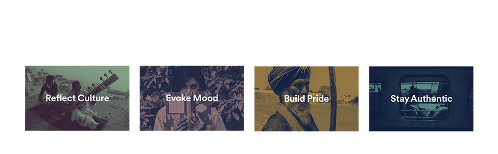
Composing the cover story for India
A playlist cover is a crucial piece in the larger puzzle. Our next task was to ensure that each cover fits seamlessly to form the bigger picture on the homepage. We created a visual guideline to define a unified look and feel for each playlist cover while playing out its individual story.
Each cover was designed to be a window into that playlist. The idea was to select images that bring out the local flavor and expression for each genre, mood, or collection. We focussed on visual narratives that evoked emotions over traditional curation by metaphors. Our team dug for real situations, expressions, and emotions over staged or posey photographs. ‘Real people living in the moment’ became the benchmark to connect with Spotify’s real audience.
Our final task was to fuse this culture-inspired look with the brand’s visual feel. We skillfully layered the regional/cultural themes and colors with that of the varied playlist moods. This blend was more focused on the moods as it dominates the playlist curation, with a hint of the culture.
Waterfield - Wealth Management App
UX/UI

Veena World - Travel Booking Website
UX/UI, WEB DESIGN

Travosh - Travel Ecommerce
UX/UI, WEB DESIGN
More Projects


